SL40: The Interiors That Defined Four Decades of Design, Part 1 (1985 to 2005)
Silverlining was founded in 1985. In the four decades since, the world of interior design has been reshaped many times over. Movements have risen and receded, and with them, ideas of what luxury, comfort and beauty should feel like.
This is the first of two articles looking back at the interiors that defined those forty years. Not a definitive list, but a considered one. These are spaces that did not just influence how rooms look, but how they are conceived, how materials are used and how detail is approached. They are part of the creative context in which Silverlining has evolved, and the ideas they introduced continue to inform how we think about making, materials and what it means to create something truly bespoke.
The provocateurs
In 1985 the language of the luxury hotel interior had barely changed in decades. Grand patterned carpets, reproduction antiques, chandeliers, mahogany and brass, spaces designed to look expensive rather than to say anything. The lobby existed to impress, not to engage.
Andrée Putman was the first to suggest there was another way. Her Morgan Hotel in New York, completed in 1984, stripped everything back. No rich colours, no heavy drapes, no gilded furniture. Instead, antique French leather club chairs, granite floors in three shades, and a black and white checkerboard pattern that became her signature. She proved that restraint was not a compromise but a choice, and that knowing what to leave out is as deliberate as knowing what to include. That clarity is something we recognise in our own work. The Console Desk, completed in 1999 and inspired by the minimalism of Jean-Michel Frank, reflects that position, wych elm surfaces supporting pillowed panels of eau de nil shagreen leather, resolved with a quiet precision that only reveals itself on close inspection.
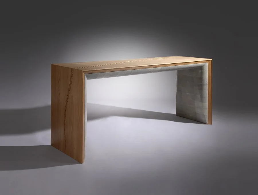
The Console Desk
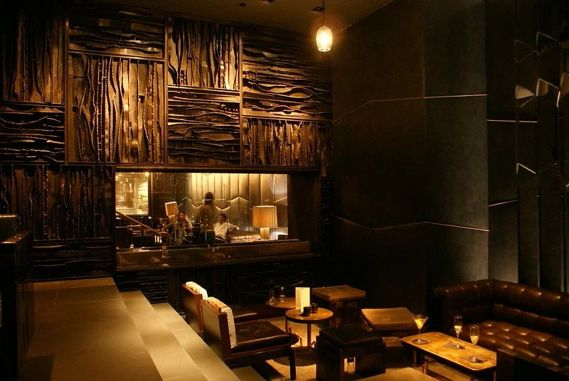
Royalton New York | “Royalton Hotel Lobby, New York” by Lawrence, CC BY-NC-ND 2.0
Then came Philippe Starck, who did the opposite and did it loudly. At the Royalton in New York, guests walked a royal-blue carpet past horn-shaped light fixtures and sunken lounge areas, the whole space functioning less like a hotel lobby and more like a stage. Starck showed that design could be an experience, something to be encountered rather than simply used. Some commissions ask not just to furnish a space but to define it. The Cosmic Dining Table, a 4.6 metre commission whose marquetry surface maps the solar system in American black burr walnut, metallised resin, mother of pearl and gold leaf, is a piece of that kind. It does not sit quietly in a room. It gives the room its reason for existing.
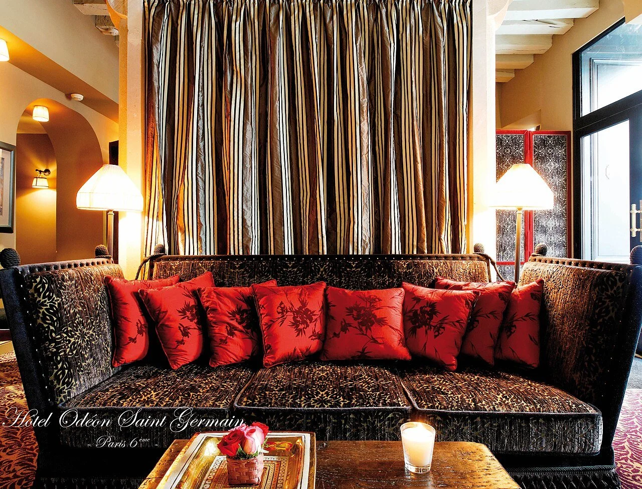
Lobby of the Hôtel Odéon Saint Germain, Paris | Jacques Garcia
The sensualists
Running in almost the opposite direction was Jacques Garcia. Where Starck provoked, Garcia indulged. The Hotel Costes, which opened in Paris in 1995, embraced richness in every sense, velvet, carved panels, deep colour, layered references. It demonstrated that intensity and atmosphere could be as powerful as restraint, and that materials carry emotion beyond their function. The depth of a leather, the warmth of a timber, the way light settles on a surface, these are not decorative decisions. They are how a piece is experienced. The Feather Bar, created for a private New York residence in collaboration with interior designer Brian J. McCarthy, belongs to that tradition. Inspired by the layered colour of the English ring-necked pheasant, it is a piece where every surface has been considered not just for how it looks but for how it makes the room feel.
Mercer Hotel in New York
The quiet revolutionaries
Christian Liaigre's Mercer Hotel in New York offered a third position entirely. Dark woods, pale walls, filtered light, spaces that felt like a private home rather than a hotel. That shift towards intimacy redefined luxury as something personal rather than performative. This is something we think about in every residential commission. The piece that works best is not the one that makes the strongest statement but the one that feels entirely right for how a particular client lives. The Duo Dining Table reflects that, two tables that unite to form a single 4.4 metre surface for larger gatherings or separate for everyday use. The design did not begin with aesthetics. It began with how a family spends its time at home.
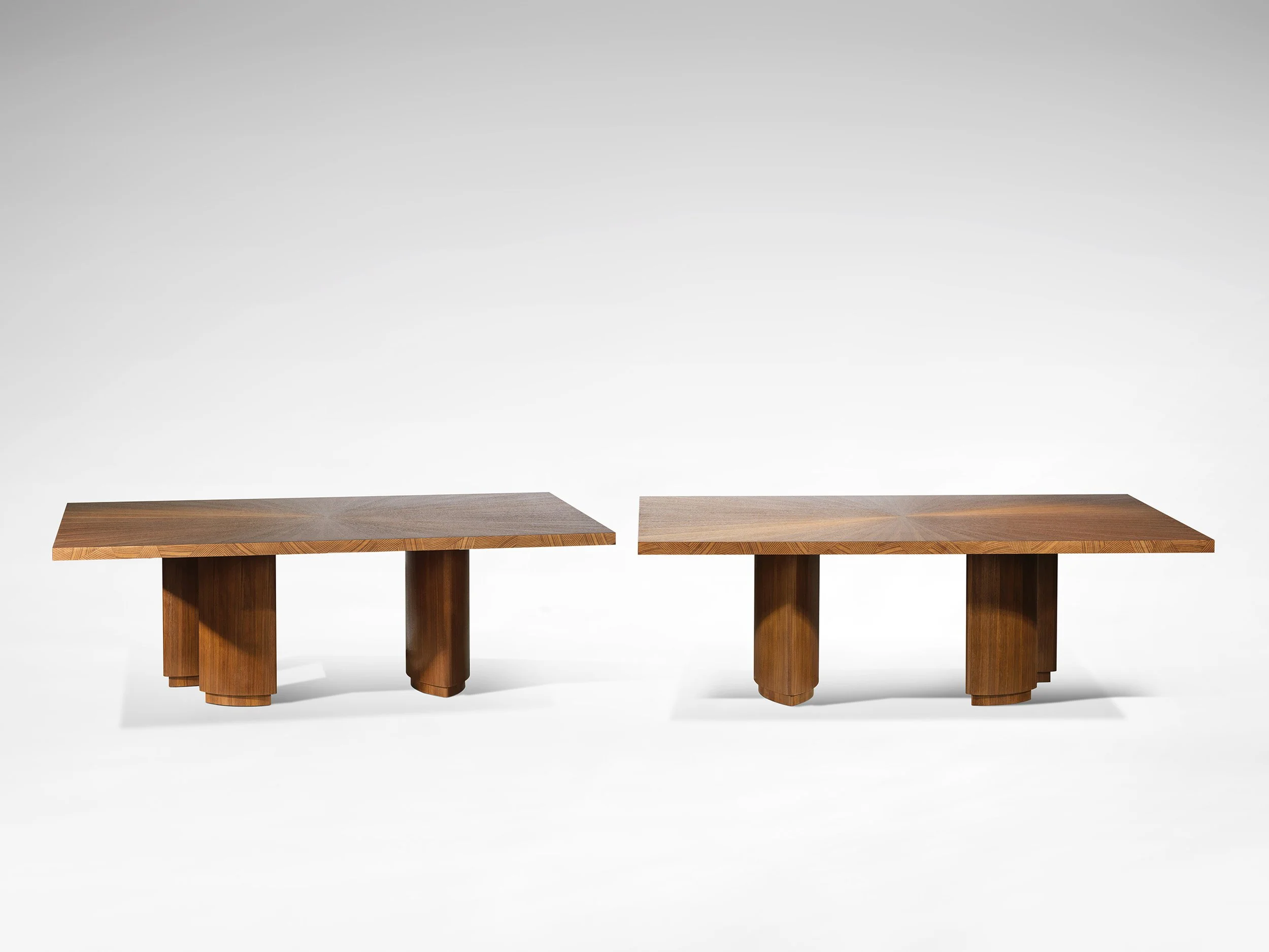
Duo Dining Table
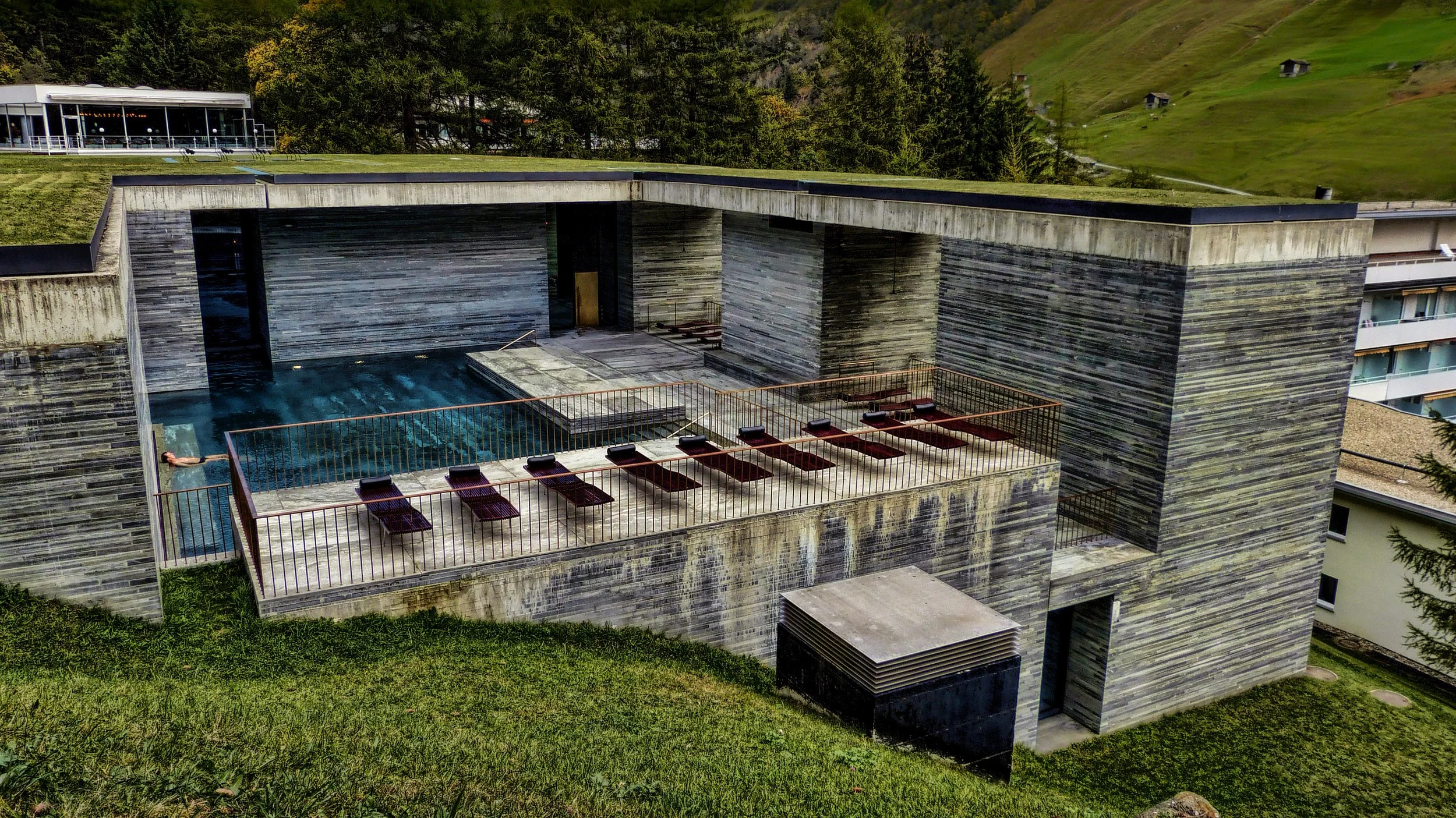
Therme Vals
The materialists
Two architects were also redefining interiors through their relationship with material, not through the spaces people gather in but through the very surfaces those spaces are made from. At Therme Vals, Peter Zumthor worked with locally quarried stone, light and water to create an atmosphere that was felt as much as seen. Carlo Scarpa focused on the moments between materials, the precision of joints, the transitions between surfaces, the depth of a shadow at an edge. Both understood that a piece is defined not only by its overall form but by how materials meet. In the workshop, we think about this constantly. The Antelope Cabinet was built on that principle, its surface constructed from stack-laminated coach-hide leather, layer upon layer of waste cuts built up to mimic the geological strata of Antelope Canyon, each layer contributing to a surface that is read rather than simply seen.
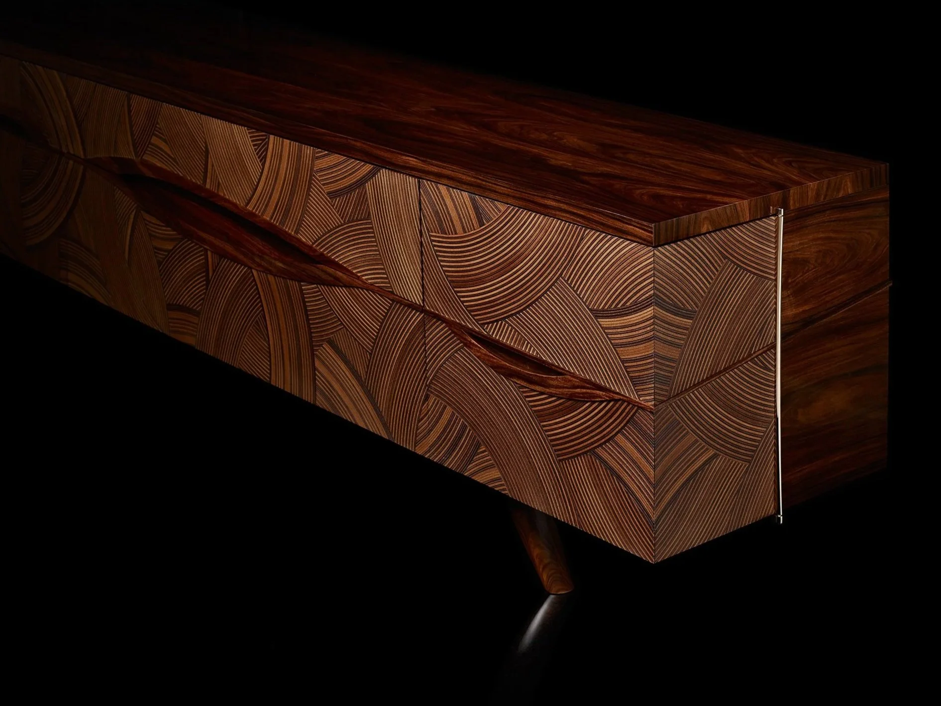
Antelope Cabinet
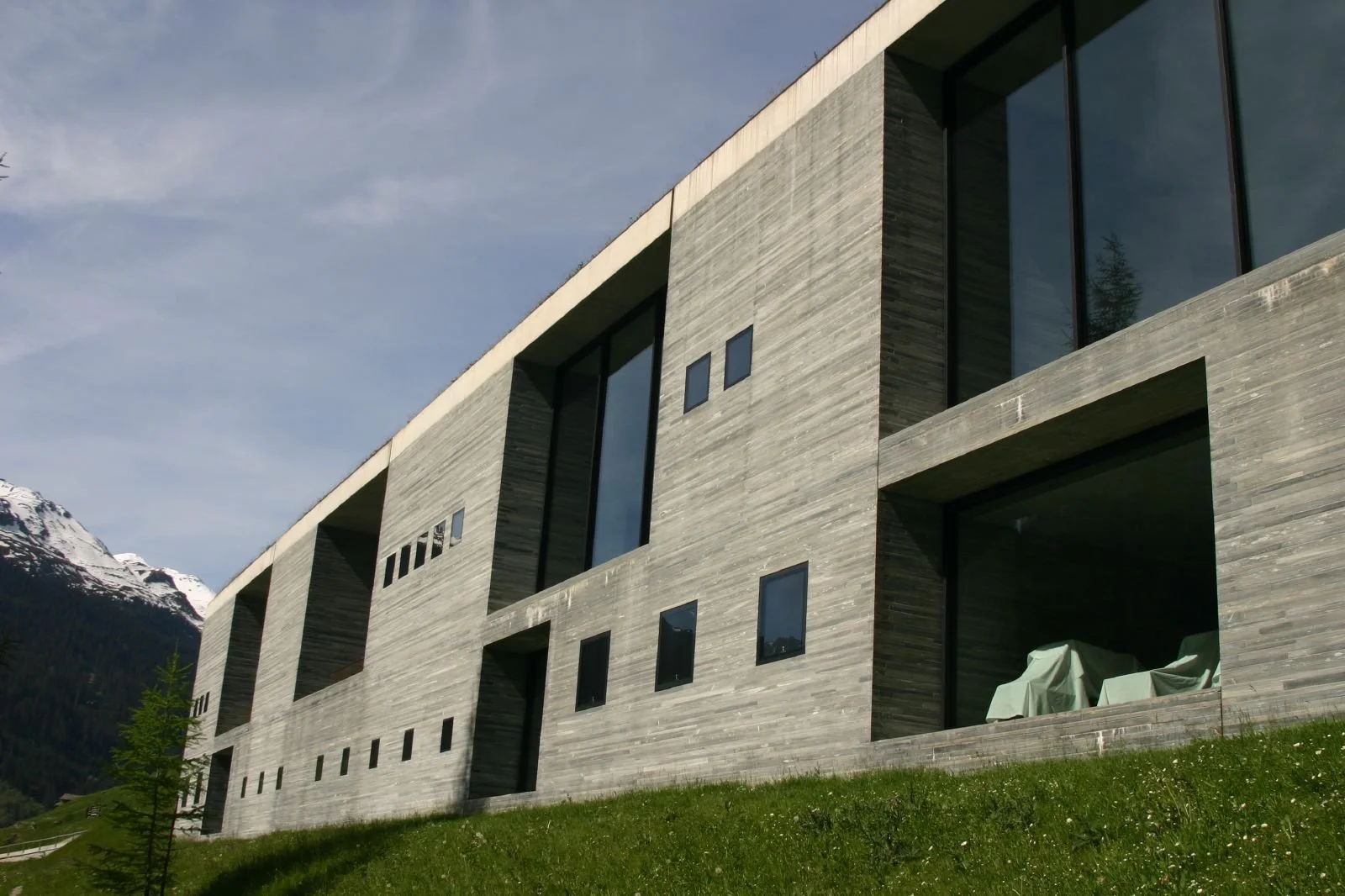
Therme Vals
The structural radical
Rem Koolhaas's Maison Bordeaux was shaped entirely around one person's life. Built for a client left in a wheelchair following a car accident, its centre was a platform the size of a small room that moved between all three floors. What made it significant was not the mechanism but the intent, that design begins with a person, not an aesthetic. That principle is at the core of bespoke work. Whether a single piece designed to integrate within an existing interior or a full scheme where every surface is resolved as part of a single composition, the starting point is always the same. Who is this for, how do they live, and what does that ask of the design.
1985 to 2005
Looking across these twenty years, what is most striking is not that one idea defined the period, but that many different approaches coexisted. Restraint and excess. Intimacy and spectacle. Simplicity and complexity.
At Silverlining, these ideas do not belong to the past. They continue to inform how we work today, in the choice of materials, in the resolution of detail, in the balance between expression and restraint. These interiors did not just shape design. They shaped a way of thinking, one that continues to influence how we design and how we make.
Subscribe to our newsletter
Sign-up to receive our newsletter and discover our stories, collections and latest innovations.

